Pages

Friday, March 30, 2012

Weekend Plans

It is Friday and we have some fun ideas for you and yours.  If you're in the tri-state area, you must visit Macy's Flower Show, especially those of us who love plants, flowers, or any vegetation.  My friend Lauren and I went with our toddlers.  The children loved all the bright colors and Brazilian inspired setting.  
Admission is free, so if you are in the area, stop in and take a look!


Here are my TOP picks: I LOVE CORAL


When Henry and I were walking home we stumbled across this fabulous couch. I LOVE the color.  Any of the Brazilian plants we saw would be the perfect accessory to this Wolf Home's couch.
This weekend is also Palm Sunday, and I love this time of year for all the obvious reasons, better weather and beautiful flowers. Jake always says he would take ten Easters over one Christmas.  Our Palm Sunday service begins in Gramercy Park, and the kids love marching around with their palms in such a lovely garden.  Now, if I can just keep Henry out of the tulips and off the grass.  
As winter has withered away we realized our courtyard is in desperate need of some lovely blooms.  I am thinking of purple and yellows to spruce up our planters.  What are you all looking forward to planting this spring?


photos by Mel


 Happy Weekending!!


Mel


Thursday, March 29, 2012

Apartment Tour: Living Room

One of the great benefits to being a painter by profession is I get to use my own artwork to help fill up some wall space!  The portrait of the four brides is one I’ve been working on off and on for years— it’s still not finished, but I needed something on the walls, so up it went.


I was obsessed with the idea of a black chandelier like this one from Domino and was thrilled to find a much less expensive, *plastic!* version from DOMa funky novelties/fashion/interior shop in Berlin.


Finding large table lamps here has been a real challenge, and I’m always wishing I could shop at a place like Home Goods.  I would kill for some ginger jar table lamps! But for some reason they’re impossible to find here on eBay or at flea markets (sigh).  The white lamp was given to us for free, and all it needed was a new lamp shade that I picked up from IKEA.  Even though it really too small for the space, it’s a cute shape, and a large stack of books and magazines helps to give it the boost it needs until we find a replacement.  


On the same table you can see a small gold frame with an antique looking photo inside.  You can use this website to upload some of your photos and give them a fun antiqued look.  

This bookshelf was another eBay find, carried back somehow on public transportation.  I had originally planned to paint it, but ended up liking the color of the wood more in person than in the photos, so we kept it as it is.  As I have mentioned in other wallpaper posts, when I traveled home for a visit with family a couple of years ago, I raided my parents’ attic for extra rolls of wallpaper left over from projects they’d finished years ago.  To give the room another layer of color and texture, I lined the back of the bookshelf with a fantastic blue-green raffia wallpaper from my parents’ guest room. 

We framed the envelopes from two wedding invitations with particularly beautiful hand-written calligraphy, one from each of our two last addresses.  At first the idea just came to me because we desperately needed some decoration, but I love the pretty simplicity of the envelopes and the reminder of the places we’ve lived.  


There are plenty of differences between life in the US and life in Germany & Austria, and one big thing we noticed right away is almost all of the apartments have NO storage.  Literally no place to put anything.  No closets, no bathroom cabinets, in some cases like our apartment in Berlin not even any kitchen cabinets.  So you have to make your own storage with bookcases, shelves, cabinets and wardrobes.  That’s why one of the first things we bought was a bunch of IKEA’s most inexpensive, adjustable wooden shelving.  They advertise it for storage rooms, like garages or basements, but I really love the contrast of the open, rustic look to some of the more formal elements in the living room, too.  

When we moved to Vienna I started thinking of ways to cover some wall space in our living room as well as show off the height of the ceilings in our early 20th century building.  (You may remember my post on this a while back.) I started thinking about a framed series of something—maps, botanical prints, vintage photos—and ended up choosing these prints from a calendar made on beautiful thick paper by Cavallini & Co.  We have actually travelled to Italy many times, including on our honeymoon, and have seen most of the places in the paintings, so they’re special to us. 

The monogrammed K pillow on the couch was a Christmas gift from my parents last year (they know us well- we LOVE anything monogrammed:)), and the two patterned pillows I made during our first year in Berlin with fabric from Printer’s Alley in Raleigh, NC.  I can’t remember its name, but I still love this fabric years later and would be thrilled to find more of it.  

The green couch is ok for now, but it’s not our favorite piece in the apartment.  We used to have a chocolate brown, super comfortable sofa, but it wasn’t a pull-out, and with a one bedroom we needed a place to put guests when they come to Vienna to visit.  The trouble was, sleeper sofas can get really expensive, so I faithfully kept a lookout on the internet and finally found this one on Craigslist for an amazing deal.  It’s not the fabric I would’ve chosen, and the couch itself could use some extra down filling to make it more comfortable, but I like the lines of it, and inside is a real feather mattress that is a million times better than our old leaky Aero Bed!  


We have loved living here, so it's sad to be packing up.  The next time I post I will have said auf Wiedersehen to Vienna!  


xo

Liza


Wednesday, March 28, 2012

Spring Necessities

Are you ready for Spring? Now that I have a little mint in my wardrobe plus these great shears I feel READY!  I find if you have the right tools for arranging you feel so satisfied. With the right shears you can accomplish anything and happily.  Every Monday I am sure to carry these smaller shears with me unless I am trimming branches.   


When you  have great shears, cherry blossoms, peach blossoms, pussy willows etc.... are easy to trim and arrange.  You can see my shears serve me well every Monday. I will say my favorite shears are my red swiss army shears Liza bought me for my thirtieth.  They are amazing. 

Happy Arranging!!!


M


The Winner is......

We are happy to announce that JESS is our Monday winner!!!  After Jane tossed everyone's name in a hat, Jess's name was pulled, and she will now be gifted custom stationery.  Thanks to everyone who participated and thank you JANE and the inspiration to "Write Happy."


Mel & Liza

Tuesday, March 27, 2012

Vienna Apartment Tour

My husband and I moved to Europe from the US over five years ago with four suitcases and zero furniture.  During our first years in Berlin and now in Vienna, we have gradually filled up our apartment with European finds.  Living on a student's budget during much of this time meant that practically our entire apartment had to be scavenged from eBay, charity shops or the Austrian version of Craigslist, but that's what makes it a fun challenge.  

At the moment, we are preparing for the movers to come and move out the things that we will ship back to the US with us, so this week is crazy.  Before we leave our apartment behind, I thought I'd take you on a little tour.


First up: the bedroom.


One reason we love this apartment is that the layout leaves most of the square footage to the entertaining and living space, which means we have plenty of room for parties and overnight guests without having to pay the higher rent that would usually correspond with it.  That means, though, that we ended up with a teensy tiny bedroom, which actually functions as 1) the place we sleep, 2) Jady's office, 3) our closet, and 4) a storage room for extra suitcases, linens, etc.  Anything we would rather not display out in the open gets stashed in here.  


So, you should know, this room is not usually open to the public:)  It's not pretty or decorated, but reflects a purely functional attempt to use the space as efficiently as possible.  I thought you might like to have a look...  And yes, we lofted our bed.  Like college students. It has given us lots of extra space in here, but we are both SO looking forward to being able to fall into a bed on the ground in our new place!


We have used a ton of IKEA's GORM shelving, as you will see on Thursday in the living room tour, as well.  It's inexpensive, easily rearranged, and it can be extended to take advantage of extra space from high ceilings.

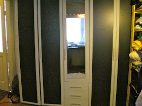
This wardrobe was a great find on eBay and is a critical piece for us since, remember, these apartments don't have any closets at all! 


 Next up: the hallway.


Here is a fun DIY project.  This little IKEA chest of drawers only costs 20 Euros normally, although we actually were given this one for free.  The price was perfect:), but it's very basic, with simple lines and unfinished wood.  To spruce it up a little, I decided to paint the outside and cover the drawers with a roll of extra raffia wallpaper I brought home from my parents' house. Between painting the couple of coats of an off white I already had lying around, I attached the paper to the drawers.  After removing the knobs, I measured and cut the wallpaper, making sure to leave enough to wrap around the edges completely.  I spread glue on the front of the drawers, wrapped the paper around and stapled behind to secure them before reattaching the knobs.  So simple!

+

=


Next: the kitchen/dining room.


I have already posted about our kitchen redo here, but now you can get a better idea of the whole room.  This photo was taken shortly after we moved in, so the white couch (with the painted pillow now on it) has since replaced the olive tree by the window, but here you can see the view from the hallway.  Don't you love the fishbone hardwood floors?? And we even have French doors, too!  You can find features like this is so many older apartments in Europe-- something I'll miss, for sure.


Check back on Thursday for a tour of our favorite room in the apartment: the living room!  

xo 

Liza

Monday, March 26, 2012

Monday Giveaway!!!

Happy Monday!!! 
a note from our friend Jane and chance to win!!

When Mel and Liza asked me to host a giveaway here on their blog, I jumped at the chance. I am always on their site getting inspired to make my life more beautiful and am so grateful for their attention to budget and taste. 

I am the owner of Plain Jane's Cards (plainjanescards.wordpress.com). I was first drawn to designing stationery because I love sending and receiving mail. There is something so exciting about opening your mailbox and finding a beautiful notecard or letter waiting for you. My motto at Plain Jane's Cards is "Write Happy." If you are happy to write, you will write more often and brighten more mailboxes. Sometimes all it takes is a beautiful card and a great pen- I love Pilot Precise, but pens are personal. I recommend you go to an office supply store near you and test a bunch. But, the stationery is important too. I love seeing personal stationery that matches the personality of its owner.
 I designed stationery for my brothers this past Christmas and picked out different fonts and colors to coordinate with their different aesthetics. So to help you "Write Happy," Plain Jane's Cards is giving away a set of personal stationery (25 printed cards with coordinating envelopes). These are just a few samples of past custom work- the choice is yours when it comes to your stationery.


We will discuss the styles you like and come up with stationery that you adore using any elements- paper, fabric, calligraphy, and font preferences.  

TO ENTER
Simply, visit plainjanescards.wordpress.com, then leave a comment here below sharing who you would "Write Happy" too.  What a  special treat, the winner will be announced on Wednesday, so check back in.


Thanks Jane!!!

Mel & Liza
  

SPRINGING FORWARD

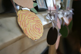
Spring has shown up in Gramercy Park. All these beautiful blooms reminded me we needed a little spring in the house, so together we made some banners and rabbit years for our Easter brunch.  We had such fun, and I broke it up in two days. I always say less is more when your working on a project with kids. My goal is to create something beautiful together, while at the same time working within the child's ability.
DAY ONE
I cut many patterns and solids of egg and bunny ear shapes.  I then had S pair the solids with patterns of her choosing. Her job then was to paste the paper eggs and bunny ears together. I of course tied the knots for our Easter crowns.  


DAY TWO
Now that Sophia can write all her letters, we focused on writing HAPPY EASTER.  This portion of the project turned out great.  It is easy for her to write single letters  separately so she felt accomplished with each letter written.  I finished up the project by stringing the letters together. I love the outcome. The project is perfect for a four year old, and you can tell she did the work while being so festive.   
Don't you just LOVE the fun colors and patterns S selected? Good eye!!!
Crafting with kids is another opportunity to stretch creatively. I loved this project-- it truly was a simple project we just whipped together.


What a perfect way to celebrate Easter and have time learning our ABCs together. Come back Wednesday for some fun floral combos, the perfect way to have a little spring in doors.

Happy Spring!!!

M