Pages

Wednesday, July 31, 2013

Light Change

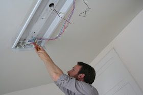
 Our kitchen has florescent lighting, or I should say DID have an extremely unattractive light fixture.  Each time I walked into the space I would roll my eyes and dream up new ways to hide the massive light.  The problem was I approached the problem thinking it would be impossible to change the light on my own, plus the Rev. may think I went tooooo far in my DIYing.  So, last Sunday when my amazingly handy friend Jeremy offered to help me re-think our kitchen space I jumped on the offer.  These projects always begin with a little fear and excitement. Jeremy suggested we just "see what we were dealing with."  So it began with a screwdriver and we ended up with a new clean look.


 Once the fixture was down, we stared at three gaping holes and headed straight to Home Depot. We knew anything would be better then what had been in there.  Happily I found a fixture for 15.00 dollars and picked up a small container of dry wall repair. Away we went with ambition and elbow grease.  

A bit of a warning. I would not attempt this job without an electrician. Jeremy basically is skilled in this regard, and so I felt completely comfortable letting him take over the electric part of this project. The impressive work of Jeremy included threading wires into new holes in the ceiling. We had to drill new holes because we are expecting a new light fixture from Restoration Hardware soon.


For messy jobs like this, WEAR A MASK!


After Jeremy put in our light fixture I began the dry walling process. First remove all the brown crusty residue from under the old fixture, then smooth on three coats of drywall, including sanding in between. 


Check in Thursday for the result!!! 


Besos,

M

Monday, July 29, 2013

Home Again-- and a Huge New Project

We are back from vacation!  We just spent two weeks up in the mountains of NC relaxing, reading (an actual book!), playing golf and tennis and all around enjoying what we like to call "adult camp."  Thank you for being so forgiving with the radio silence on my end for the past week-- I'm glad to be back!  The good news is, about four days before it was time to come home my mind started switching gears back into home renovation mode, and now we have plenty of future projects planned to keep us busy and me posting!  

While away, we decided to tackle one of the biggest projects we have ever done: building a deck.  Maybe it was the vacation talking, or maybe it was the professional estimate we got that nearly made us fall over it was so high... but either way, somehow we decided that this is something we can do ourselves.  So I put down the book and spent my last couple of days pouring over you tube videos and websites about deck building... which I very quickly learned requires a lot of planning and foresight.  You don't just wing it with a deck, in other words.  No figuring it out as we go.  To help with the planning process, we stopped by Lowe's and picked up two enormous books on building decks for me to read on the ride home.


I ended up being so glad I bought two books, since there were several points where I found one confusing and the other helped clarify what on earth I was supposed to be learning (so at this point I was feeling juuuuuust a little overwhelmed).  The overall concept of a deck is pretty simple, but figuring out the precise layout, keeping all of the variables that affect each other straight in my mind, and calculating the load capacity of your type of lumber based on distances between joists and posts was starting to make my head hurt just a little.

Although I'm sure we could have just relied on the books, I wanted reassurance from an actual professional that this deck we're building is not going to sag, or rot the house, or collapse when we throw our next big party!  Remember all of those months we had work done on this house when we first moved in?  Back then we had professionals doing all kinds of things in this place, and after spending day after day with these guys, some of them became real friends.  We missed them once they finished!  So to get some advice and to find out if we are crazy for trying to build a deck ourselves, I called Brian, who has always encouraged us in our DIY efforts, given free advice and answered about a thousand of my questions.  He admitted that a deck is a pretty serious job to take on, but assured us that it's doable.  Armed with my notes from our conversation and a new confidence that we can actually do this, we decided to take the plunge!  Here's what we're thinking:  

So we already have a deck of sorts off the side of the house, most of which is the screened porch leading out from the kitchen (under the wall of built in bookshelves).  There is also a small section of uncovered deck there already, which will tie in the screened porch to the back section we're building, creating a wrap around deck perfect for good flow and integration with the house.  Yes, this is a party deck we're planning here:)


Here you can see where we marked off the dimensions we thought might work for the new deck with stakes and string to help visualize the end result.  Beyond creating a space we could really use and enjoy, our big goal in planning the layout was to keep the deck in proportion 1) to the house itself, and 2) to the rest of the yard.  I found several formulas suggested online for calculating maximum deck size (most say something like no more than 20% of the home's total square footage), and staking off the space before beginning still helped us to get a feel for the balance as well.  We ended up deciding on a deck that's 30 feet wide, running from the edge of the side deck to a few feet in from the other end of the house (more on why we did that later!), and 14 feet deep.  Originally we had thought 16 feet might be best, but after staking off the dimensions the deck seemed to overwhelm the rest of the yard too much, and 14 feet will still give us plenty of space for what we need.


Sometimes a simple rectangular deck can look a little bit boring, so we decided to go for a slight modification to ours by cutting off the corner on one side.  The other side can stay square, since it will be up against tree and flower beds, but we're thinking this right corner will look better softened and rounded-- and mostly, we wanted to make things harder for ourselves:)


Here we go!  I can't wait to update you on our progress!

xo

Liza

Friday, July 26, 2013

Dinner Parties Part Two

A dinner party would be NOTHING without flowers. I know that may sound dramatic, but I can not imagine a dinner party without flores. Just the other day, on a tight budget I was able to arrange flowers for a party of 28 people at 34 dollars for the entire event. Often when you stick with seasonal flowers your will find yourself saving dinero. Since I was going for the French cafe look, I decided white wild flowers were essential. In the Union Square Farmer's Market, I found Scabiosas (bad name/beautiful flowers), Queen Mary's lace, plus a dash of color. 

WARNING: MANY PHOTOS AHEAD!!!!


Wednesday, July 24, 2013

Dinner Parties Part One

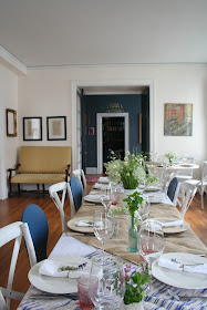
When I was a young teenager, I often thought of opening in a cafe somewhere in San Francisco and naming the spot "Cafe Luna." So it is of no surprise I love to throw dinner parties. Last night was no different, and we happily hosted a dinner for 28 people. Now, we are still without most of our furniture, so our space lends itself to be transformed easily, which I love. When I approached this party, I had French cafe in mind and went for it. 


When you are coming up with creative seating, I say think outside the box. I often set up our seating arrangement the night before; then when the morning arrives, I sit in the space to make sure the space feels right. 

P.S. I also find it is often more fun to have a couple of quirky spots. Not everyone socializes easily and having some dinning areas that are tucked away can make for a cozy atmosphere. 


I love using a variety of table tops. It is more fun to have rounds, smalls and long rectangular seating. Keep your guests on their toes!!!


Mil Besos!!!


MEL

Monday, July 22, 2013

My Favorite Spot.....

Get ready for some photos, guys!  I have been working daily on our family's new favorite spot, the den. The kids love the space and so do we. I have been busy trying to make this space cozy, especially while we wait for the rest of our furniture to arrive.


Here are a few BEFORE photos....


I knew I wanted the space to be a dark gray (Anvil by B.M.), so the space would be perfect for movie night. The yellow that was in here was not doing anything for the space, especially with blonde flooring. So instead I went with dark grays.

 I loved the choice, but soon realized I needed to paint the back of the book shelves, just to finish the thought. Even after I placed books in the shelves, the brown was so dull and made our space look old. I decided on B.M.'s Black Ribbon. I love the result.


 The space needed a small lift, so I spray painted book these piggy bookends to add a splash.


The space is a work in progress, but for now the den is our favorite place to be.

Mill Besos,

Mel

Friday, July 19, 2013

A Little Gold

Last week while Nia and I were waiting for my side tables to dry we decided to add a touch of gold to the guest room.  With just one small jar of Gold Leaf we were on our way......


 A few drops fell on Nia's shoe while we were working. What to do??? Paint the shoes gold, too!!!


Mil Besos,

M

Thursday, July 18, 2013

Rethinking the Kitchen?

We did so much fun renovation work in our kitchen and have been loving the new island, the more functional layout after closing off a doorway and the new lighter cabinet color (among other things).  We still need to decide on what kind of tile to use for the backsplash (white subway? marble? arabesque?), and in brainstorming about this question I've been stuck on another idea (oh boy, the exact words that keep getting us in trouble:)).


Since the beginning stages of designing this kitchen I have toyed with the idea of installing upper cabinets up to the ceilings.  I love the look but always wondered if it would be worth the extra expense.  Extra storage sounds great, but do you ever really get up there and use it?  I wonder if I would just forget what I had stuck up there...

So I thought we should just live in the kitchen for a while before deciding what to do.  We have plenty of options to finish things off: 

1) The cheapest: we leave things as they are (except for installing a backsplash), unembellished and embracing the industrial chic of the exposed venting from the hood, which I like.

2) The mid range: top off our current cabinets with crown molding.

3) The all-out: add small upper cabinets all the way around, finishing with crown molding throughout the room.  Did I mention, I love this look?


One happy benefit of the most involved option, beyond looking good:), is that if the cabinets extend all the way up, then I can tile the backsplash all the way to the ceiling around the window.  I'm thinking I would remove the cabinet just to the right of the window and install it on the left so that that left hand line of cabinets extends all the way to the back wall.  That way the window will have around a couple of feet of free space on both sides, which is where I would tile all the way up.  Here's an inspiration photo that I've kept in the back of my mind for ages.


Here's how it looks at the moment:


And here's how it could look with the extra height from the upper cabinets and crown molding, one cabinet moved from the right of the window to the left, and the blue area all covered with tile.  I like how this look is more balanced with the extra space around the window, and how it emphasizes our high ceilings.


It's just a thought, though, and it's obviously the most involved option, which might mean we can't justify the extra cost at the moment.  But it sure is fun to plan it! You know, just in case:)

Do you have super high upper kitchen cabinets? And do you use them? I'd love to know:)

xo

Liza